
Abstract
Like a Navigation Controller, a Tab Bar Controller also groups related view controllers together. The main difference is that a Navigation Controller can only display view controllers in sequential order. On the other hand, a Tab Bar Controller can jump to another view controller directly.
We’re sorry, something doesn't seem to be working properly.
Please try refreshing the page. If that doesn't work, please contact support so we can address the problem.
Like a Navigation Controller, a Tab Bar Controller also groups related View Controllers together. The main difference is that a Navigation Controller can only display View Controllers in sequential order. On the other hand, a Tab Bar Controller can jump to another View Controller directly.
While a Navigation Controller always displays a navigation bar and a Back button on every View Controller it opens, a Tab Bar Controller always displays a list of icons at the bottom of the screen where each icon represents a different View Controller. By tapping on an icon, the user can jump to that particular View Controller right away. Then the user can return to the Tab Bar Controller again to see the list of icons representing the other View Controllers as shown in Figure 18-1.
Because a Tab Bar Controller can only display a limited number of icons at the bottom of the screen, this tends to limit the number of View Controllers that the Tab Bar Controller can contain. As a general rule, five icons is usually the maximum number to appear on a Tab bar to look aesthetically pleasing on an iPhone in portrait orientation.

A Tab bar Controller displays icons that represent multiple views
Similar to a Tab bar is a Toolbar. While a Tab bar is strictly for navigating to different views, a Toolbar displays icons that represent actions that the user may want to perform. Many of the apps that come with iOS display a Toolbar at the bottom of the screen such as Mail and the Photos app, which can delete a selected message or photo as shown in Figure 18-2.

Many apps display a Toolbar at the bottom of the screen
Both tab and Toolbars are limited by the number of icons that can comfortably appear at any given time. The more icons, the more cluttered the Tab bar appearance and the harder it will be for a user to tap the right icon. As a general rule, don’t display too many icons on a Tab bar that will make finding or choosing any particular icon too difficult for the user.
The main differences between a Tab Bar bar and a Tool Bar are
-
A Tab Bar displays different View Controllers.
-
A Tool Bar runs different commands.
Switching View Controllers in a Tab Bar Controller
Tab Bar Controllers make it easy to switch from one view to another in any order you wish. Each icon on the Tab bar represents a different View Controller. The basic steps to using a Tab Bar Controller to represent different views are to add multiple View Controllers to your storyboard and then Ctrl-drag to connect the Tab Bar Controller to a View Controller.
Then the next step is to create a title and icon to represent that View Controller. You may also want to reorder the icons on the Tab bar or delete a View Controller and its Tab bar icon later.
To see how to create a simple Tab Bar Controller, follow these steps:
-
1.
Create a new iOS project using the Single View App template (see Chapter 1) and name this new project TabBarApp. This creates a single view for the user interface.
-
2.
Click the Main.storyboard file in the Navigator pane. Xcode displays the single view.
-
3.
Click the View Controller Scene at the top of the View Controller.
-
4.
Choose Editor ➤ Embed In ➤ Tab Bar Controller. Xcode displays a Tab Bar Controller in the storyboard connected to the existing View Controller as shown in Figure 18-3.
Figure 18-3 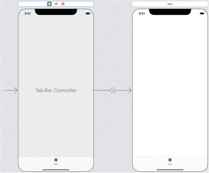
Embedding a view inside a Tab Bar Controller
-
5.
Click the Library icon to open the Object Library window.
-
6.
Drag and drop a View Controller from the Object Library window to the storyboard as shown in Figure 18-4.
Figure 18-4 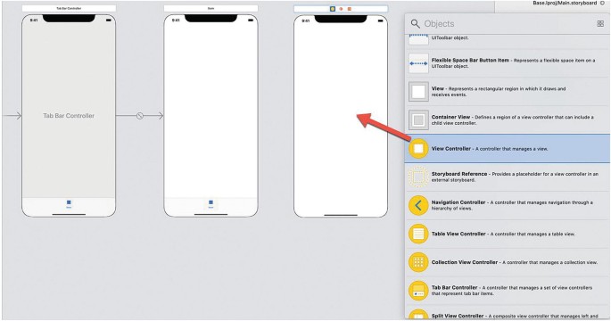
Dragging and dropping a View Controller onto the storyboard
-
7.
Move the mouse over the Tab Bar Controller icon at the top of the Tab Bar Controller (or over the Tab Bar Controller in the Document Outline).
-
8.
Hold down the Control key and Ctrl-drag over the newly added View Controller you just added to the storyboard as shown in Figure 18-5.
Figure 18-5 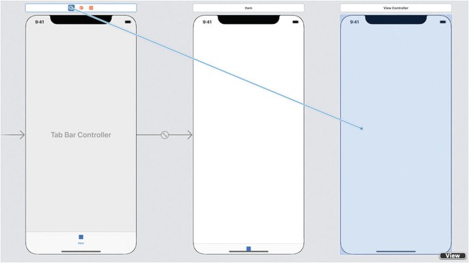
Ctrl-dragging from the Tab Bar Controller to the separate View Controller
-
9.
Release the left mouse button and the Control key. A popup menu appears as shown in Figure 18-6.
Figure 18-6 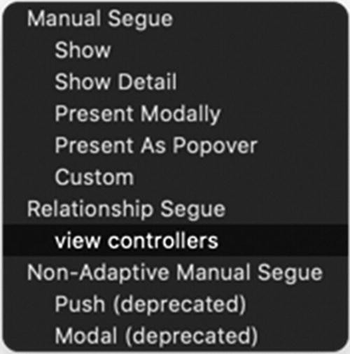
A popup menu for connecting a View Controller to a Tab Bar Controller
-
10.
Choose View Controllers under the Relationship Segue category. Xcode draws an arrow (segue) linking the Tab Bar Controller to the newly added View Controller as shown in Figure 18-7. (You may need to move the View Controller to see that the Tab Bar Controller’s segues fork to connect to both View Controllers.)
Figure 18-7 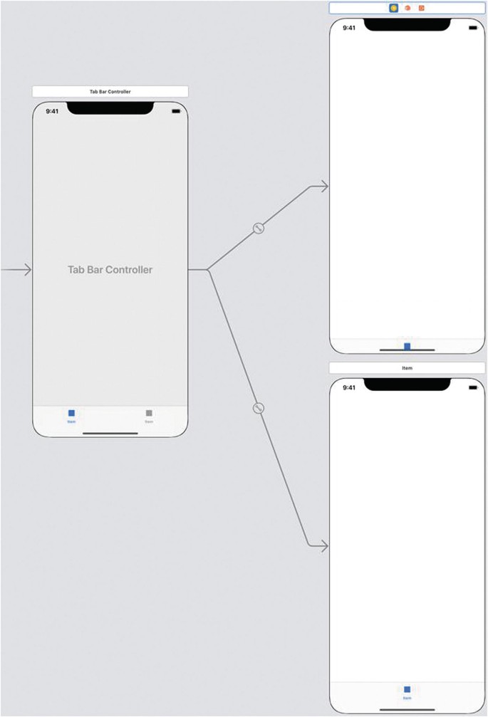
A segue links two views within a Navigation Controller
-
11.
Click in the middle of the top View Controller (or click view in the Document Outline).
-
12.
Choose View ➤ Inspectors ➤ Show Attributes Inspector, or click the Attributes Inspector icon in the upper right corner of the Xcode window.
-
13.
Click in the Background popup menu and choose a color such as yellow.
-
14.
Click in the middle of the bottom View Controller (or click view in the Document Outline).
-
15.
Click in the Background popup menu and choose a color such as orange.
-
16.
Click the Run button or choose Product ➤ Run. The Simulator window appears, displaying a colored screen of the first View Controller.
-
17.
Click the second icon on the Tab bar at the bottom of the screen. The second View Controller appears showing a different color.
-
18.
Choose Simulator ➤ Quit Simulator to return to Xcode.


Customizing Tab Bar Icons
Tab Bar Controllers display icons on a Tab bar at the bottom of the screen. By default, this icon simply displays a generic label such as “Item”, but you can customize this icon to include more descriptive text and/or an icon. You can create icons using a graphics editor such as Adobe Illustrator. When creating your own icons, be sure to follow Apple’s guidelines for designing icons ( https://developer.apple.com/design/human-interface-guidelines/ios/icons-and-images/custom-icons/ ).
As an alternative to creating your own icons, you can buy or download icons from the following sites:
-
iconbeast.com
-
icons8.com
-
pixellove.com
To see how to customize Tab bar icons, follow these steps:
-
1.
Make sure the TabBarApp is loaded in Xcode.
-
2.
Download two or more free icons from any site that offers free icons.
-
3.
Click the Assets.xcassets folder.
-
4.
Click the + icon to display a popup menu as shown in Figure 18-8.
Figure 18-8 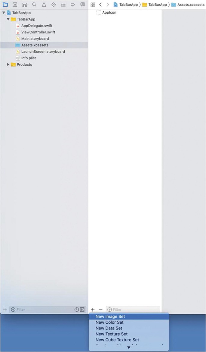
Creating a new image set in the Assets.xcassets folder
-
5.
Choose New Image Set. Xcode displays an Image item underneath AppIcon.
-
6.
Click this Image item and press ENTER to highlight the text as shown in Figure 18-9.
Figure 18-9 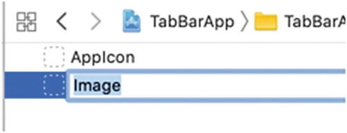
Editing the Image name
-
7.
Type First and press ENTER.
-
8.
Drag and drop an icon into all the placeholders labeled 1x, 2x, and 3x as shown in Figure 18-10.
Figure 18-10 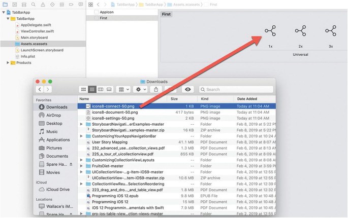
Dragging and dropping icons into the image set
-
9.
Repeat steps 5–8 but label this image set Second and drag and drop a different icon into each 1x, 2x, and 3x placeholder as shown in Figure 18-11.
Figure 18-11 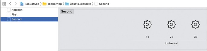
Creating two image sets with icons


Figure 18-11. Creating a second image set.
Note
The 1x image appears on older iOS device screens. The 2x image appears on Retina displays. The 3x icon image appears on Retina Display HD displays for the iPhone X and later models.
-
10.
Click the Main.storyboard file in the Navigator pane.
-
11.
Click Item in the Document Outline as shown in Figure 18-12.
Figure 18-12 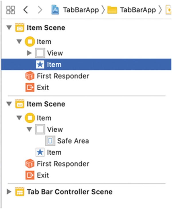
Selecting the tab bar on a View Controller
-
12.
Choose View ➤ Inspectors ➤ Show Attributes Inspector, or click the Attributes Inspector icon in the upper right corner of the Xcode window.
-
13.
Click the Image popup menu under the Bar Item category and select First as shown in Figure 18-13.
Figure 18-13 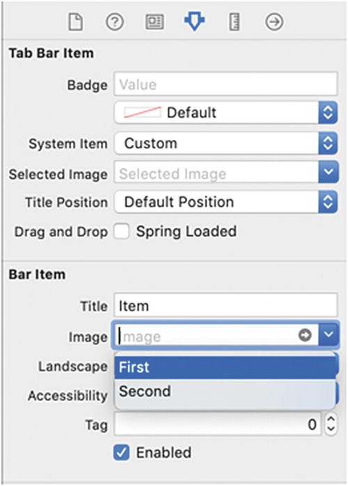
Choosing an image set for a Tab bar icon
-
14.
Click in the Title text field, delete the “Item” text, type the color of the View Controller (such as yellow), and press ENTER. Notice that the Tab bar now displays your chosen icon and text.
-
15.
Repeat steps 11–14 for the other Tab bar item except choose Second for its Image and type a different color for its Title.
-
16.
Click the Run button or choose Product ➤ Run. The Simulator window appears showing the two icons on the Tab bar as shown in Figure 18-14.
Figure 18-14 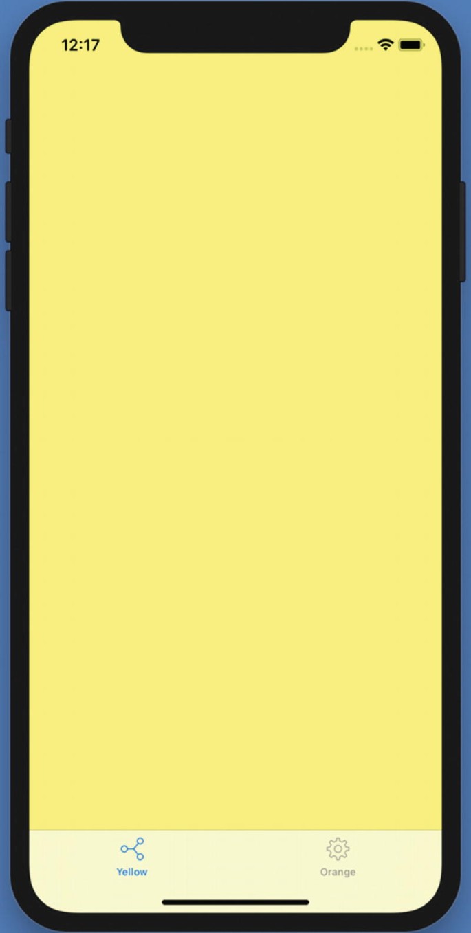
The Tab bar displaying the custom text and icon
-
17.
Click the second tab. Notice that the second View Controller appears for that tab.
-
18.
Click the first tab. Notice that the first View Controller appears for that tab.
-
19.
Choose Simulator ➤ Quit Simulator to return to Xcode.


Deleting View Controllers from a Tab Bar Controller
You can connect multiple View Controllers to a Tab Bar Controller. However, if you later want to disconnect a View Controller from a Tab Bar Controller, you have two options:
-
Delete the View Controller and its segue from the Tab Bar Controller.
-
Delete just the segue from the Tab Bar Controller but keep the View Controller.
Deleting a View Controller will delete both the segue from the Tab Bar Controller and the View Controller, but this also means you’ll lose everything stored on that View Controller such as buttons, text fields, and labels. Another option is to delete just the segue and keep the View Controller.
To delete both a View Controller and its segue from a Tab Bar Controller, follow these steps:
-
1.
Click the Main.storyboard in the Navigator pane.
-
2.
Click the Item Scene in the Document Outline that represents the View Controller you want to delete and disconnect from the Tab Bar Controller as shown in Figure 18-15.
Figure 18-15 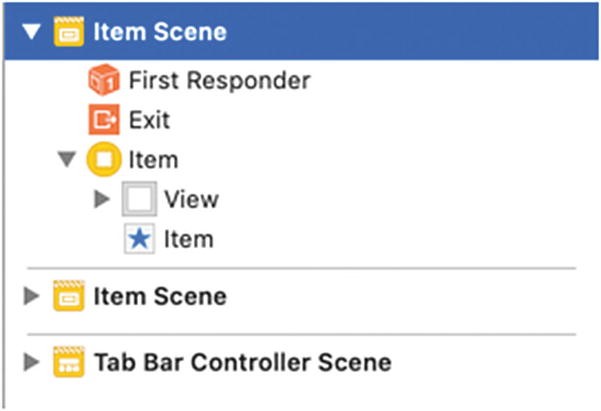
Selecting an Item Scene to delete from a Tab Bar Controller
-
3.
Press BACKSPACE or DELETE. Xcode removes the selected View Controller and the segue connecting it to the Tab Bar Controller.

Note
If you make a mistake deleting a segue and/or its connecting View Controller, choose Edit ➤ Undo or press Command + Z to undo the delete command.
Sometimes you may not want to delete a View Controller. Instead, you just want to disconnect it from a Tab Bar Controller. To disconnect a View Controller’s segue to a Tab Bar Controller while keeping the View Controller, follow these steps:
-
1.
Click the Main.storyboard in the Navigator pane.
-
2.
Click a Relationship icon under the Tab Bar Controller Scene in the Document Outline as shown in Figure 18-16.
Figure 18-16 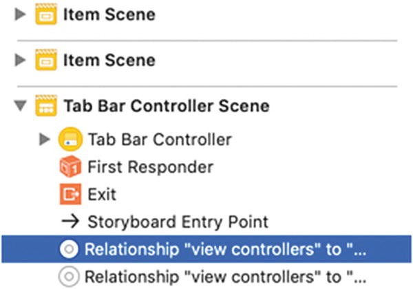
Selecting a segue in the Document Outline
-
3.
Press BACKSPACE or DELETE. Xcode removes the segue to the Tab Bar Controller but keeps the View Controller in the storyboard.

Creating a Tool Bar
Similar to Tab Bar Controller is a Tool Bar. While a Tab Bar Controller is designed to display icons at the bottom of the screen that represent different views users can open, a Tool Bar is meant to display icons that represent different commands the user can choose. The two objects to use from the Object Library window are shown in Figure 18-17:
-
Tool Bar – Displays a bar at the bottom of the screen
-
Bar Button Item – Displays text and/or an icon on a Toolbar

The Toolbar and Bar Button Item on the Object Library window
To see how to add a Toolbar and icons and connect them to IBAction methods, follow these steps:
-
1.
Create a new iOS project using the Single View App template (see Chapter 1) and name this new project TabBarMethodsApp. This creates a single view for the user interface.
-
2.
Click the Main.storyboard file in the Navigator pane. Xcode displays the single view.
-
3.
Click the Library icon to open the Object Library window.
-
4.
Drag and drop a Tool Bar from the Object Library window to the bottom of the view as shown in Figure 18-18.
Figure 18-18 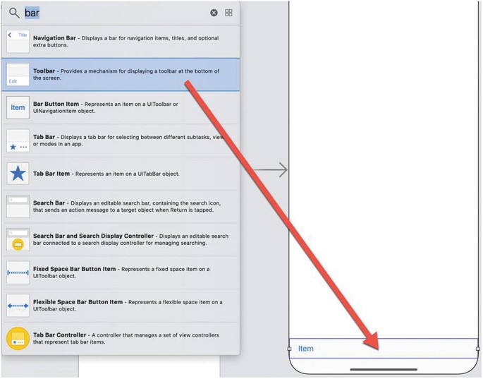
Dragging and dropping a Toolbar onto a view
-
5.
Click Item underneath Toolbar in the Document Outline as shown in Figure 18-19. This selects the bar button currently visible on the Toolbar.
Figure 18-19 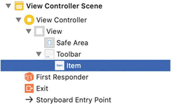
The Bar Button Item on the Toolbar in the Document Outline
-
6.
Choose View ➤ Inspectors ➤ Show Attributes Inspector, or click the Attributes Inspector icon in the upper right corner of the Xcode window.
-
7.
Click in the System Item popup menu. A popup menu appears, listing common types of icons you can select as shown in Figure 18-20.
Figure 18-20 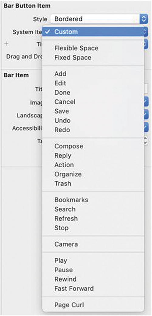
Clicking the System Item popup menu
-
8.
Choose Add. Notice that Xcode now displays the bar button as a + icon.
-
9.
Choose View ➤ Assistant Editor ➤ Show Assistant Editor, or click the Assistant Editor icon in the upper right corner of the Xcode window. Xcode displays the Main.storyboard file and the ViewController.swift file side by side.
-
10.
Move the mouse pointer over the Add (+) button on the Toolbar, hold down the Control key, and Ctrl-drag from the Add (+) button just above the last curly bracket at the bottom of the ViewController.swift file.
-
11.
Release the Control key and the left mouse button. A popup window appears.
-
12.
Click in the Name text field and type addTapped .
-
13.
Click in the Type popup menu and choose UIBarButtonItem. Then click the Connect button. Xcode creates an addTapped IBAction method.
-
14.
Edit this addTapped IBAction method as follows:
@IBAction func addTapped(_ sender: UIBarButtonItem) { let alert = UIAlertController(title: "Add", message: "Add button tapped", preferredStyle: .alert) let okAction = UIAlertAction(title: "OK", style: .default, handler: { action -> Void in //Just dismiss the action sheet }) alert.addAction(okAction) self.present(alert, animated: true, completion: nil) }
The entire ViewController.swift file should look like this:
import UIKit class ViewController: UIViewController { override func viewDidLoad() { super.viewDidLoad() // Do any additional setup after loading the view. } @IBAction func addTapped(_ sender: UIBarButtonItem) { let alert = UIAlertController(title: "Add", message: "Add button tapped", preferredStyle: .alert) let okAction = UIAlertAction(title: "OK", style: .default, handler: { action -> Void in //Just dismiss the action sheet }) alert.addAction(okAction) self.present(alert, animated: true, completion: nil) } }
-
15.
Click the Run button or choose Product ➤ Run. The Simulator window appears, displaying the Toolbar and the Add (+) button at the bottom of the screen.
-
16.
Click the Add (+) button. An alert controller appears.
-
17.
Click OK to dismiss the alert controller.
-
18.
Choose Simulator ➤ Quit Simulator to return to Xcode.


Adding and Deleting Tool Bar Buttons
When you add a Toolbar, it comes with one bar button generically labeled “Item”. After customizing this one bar button, you may want to add more buttons to a Toolbar. If you add too many bar buttons, you can always delete them. Bar buttons can display icons and/or text as shown in Figure 18-21.

Bar buttons typically display text or icons
Note
Although bar buttons can display both text and icons, you can also use one or the other. If you have three or fewer buttons on a Toolbar, text (with no icon) can make each option easier to understand. If you have more than three buttons on a Toolbar, icons (with no text) take up less space but at the sacrifice of the user not understanding what command each icon may represent.
Besides bar buttons, another object you can add to Toolbars is spaces. Xcode offers two different types of spaces as shown in Figure 18-22:
-
Fixed space – Defines an exact value for space between two bar buttons
-
Flexible space – Acts like a spring that shrinks or expands between two bar buttons when viewed on different size screens such as an iPhone and an iPad

Two types of spaces you can add between bar buttons
To see how to add, delete, and add spaces on a Toolbar, follow these steps:
-
1.
Create a new iOS project using the Single View App template (see Chapter 1) and name this new project ToolBarEditApp. This creates a single view for the user interface.
-
2.
Click the Main.storyboard file in the Navigator pane. Xcode displays the single view.
-
3.
Click the Library icon to open the Object Library window.
-
4.
Drag and drop a Tool Bar onto the bottom of the view. A generic “Item” bar button appears on the Toolbar.
-
5.
Click the Library icon to open the Object Library window and drag and drop a Bar Button Item onto the Toolbar. Notice that the two bar buttons appear close together as shown in Figure 18-23.
Figure 18-23 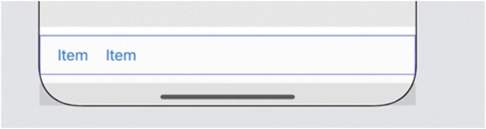
Two bar buttons appear on a Toolbar
-
6.
Click the Library icon to open the Object Library window and drag and drop a Fixed Space Bar Button Item onto the Toolbar in between the two existing bar buttons. The Fixed Space Bar Button Item simply adds space between two bar buttons and appears invisible.
-
7.
Click Fixed Space in the Document Outline to select the Fixed Space Bar Button Item.
-
8.
Choose View ➤ Inspectors ➤ Show Size Inspector, or click the Size Inspector icon on the upper right corner of the Xcode window.
-
9.
Click in the Width text field, type 75, and press ENTER. The Width property defines the exact spacing of the Fixed Space Bar Button Item.
-
10.
Click the Run button or choose Product ➤ Run. The Simulator window appears, displaying the Toolbar at the bottom of the screen with its two bar buttons.
-
11.
Choose Hardware ➤ Rotate Left. Notice that the spacing between the two bar buttons on the Toolbar remains the same as shown in Figure 18-24.
Figure 18-24 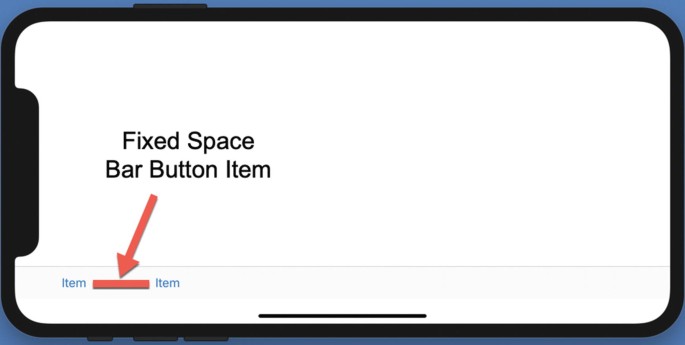
The Fixed Space Bar Button Item maintains an exact distance between two bar buttons
-
12.
Choose Simulator ➤ Quit Simulator to return to Xcode.
-
13.
Click Fixed Space in the Document Outline and press BACKSPACE or DELETE to remove the Fixed Space Bar Button Item.
-
14.
Click the Library icon to open the Object Library window and drag and drop a Flexible Space Bar Button Item onto the Toolbar in between the two existing bar buttons. Notice that Flexible Space Bar Button pushes the two bar buttons on opposite ends of the Toolbar as shown in Figure 18-25.
Figure 18-25 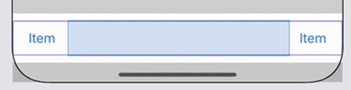
The Flexible Space Bar Button Item acts like a spring between two bar buttons
-
15.
Click the Run button or choose Product ➤ Run. The Simulator window appears, displaying the Toolbar at the bottom of the screen with its two bar buttons at opposite ends of the Toolbar.
-
16.
Choose Hardware ➤ Rotate Left. Notice that the spacing between the two bar buttons on the Toolbar expands to accommodate the wider distance of the iPhone in landscape orientation as shown in Figure 18-26.
Figure 18-26 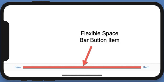
The Flexible Space Bar Button Item pushes two bar buttons regardless of the iOS device orientation
-
17.
Choose Simulator ➤ Quit Simulator to return to Xcode.


Summary
Tab Bar Controllers display icons at the bottom of the screen that represent different View Controllers. Unlike a Navigation Controller that forces users to display View Controllers in sequential order, Tab Bar Controllers let users navigate to different View Controllers in any order. Because a Tab Bar Controller can only display a limited number of icons, users can only navigate to a limited number of View Controllers.
A Tool Bar also displays icons at the bottom of the screen. While a Tab Bar displays icons that jump to a different View Controller, a Tool Bar displays icons that represent different commands to manipulate data currently displayed on the screen. For example, the Mail app displays icons at the bottom of the screen while showing messages. One icon lets you delete the message, while another lets you forward it. Yet another icon lets you store the message in another folder.
Buttons can display text and an image, although it’s more common for buttons to display text or an image, but not necessarily both. Text makes it easy to understand the purpose of each button, but text buttons take up more space. Icons take up far less space but can be harder to understand what they represent.
When placing buttons on a Toolbar, you can also define spacing between buttons using either fixed or flexible spacing. Fixed spacing lets you define a specific value for spacing between two buttons. Flexible spacing lets the spacing between buttons shrink or expand depending on the orientation of the iOS device.
By using Tab Bars to navigate to different View Controllers or Tool Bars to display different types of commands available to manipulating currently displayed data, you can make your app easier to use.
Author information
Authors and Affiliations
Rights and permissions
Copyright information
© 2019 Wallace Wang
About this chapter

Cite this chapter
Wang, W. (2019). Using Tab Bars and Tool Bars. In: Beginning iPhone Development with Swift 5. Apress, Berkeley, CA. https://doi.org/10.1007/978-1-4842-4865-2_18
Download citation
DOI: https://doi.org/10.1007/978-1-4842-4865-2_18
Published:
Publisher Name: Apress, Berkeley, CA
Print ISBN: 978-1-4842-4864-5
Online ISBN: 978-1-4842-4865-2
eBook Packages: Professional and Applied ComputingApress Access BooksProfessional and Applied Computing (R0)